
In todays session, we looked at how to work with colours in Adobe Photoshop.
Once Photoshop is open, first check the colour mode to see if the file is set up how you need, CMYK, RGB etc.
Photoshop files usually open in RGB, which is the standard file for web based design and the computer screen.
RGB colour is an additive process
whereas CMYK is subtractive.
In
Photoshop, we still work in RGB when designing for print, but can use a
couple of tools in Photoshop to check whether the image will be
printable by using either the 'Gamut Warning' or the 'Proof Colours'
tool.
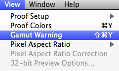
If prompted, the 'Gamut Warning' shows the areas of the image unable to translate to print as a grey mass, as pictured below.

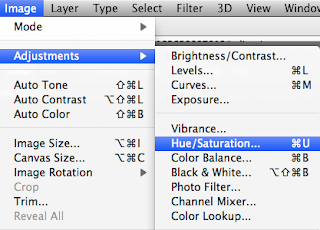
You
can render this problem though by opening up 'Hue/Saturation' and
lowering the saturation, in effect dulling the image and reducing how
vibrant the original was.
The
other way to check if the colours in the image are all suitable for
print is by the 'Proof Colours' tool, just above the 'Gamut Warning'
option (which is probably a better tool).
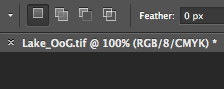
This
indicates that the 'Proof Colours' tool is on, showing you're working
in RGB colours but it's showing you the image you'd see, or a closer
representation to the print, in CMYK.
Adobe
Illustrator swatches can be displayed in CMYK percentages if the user
wants, however, this isn't available in Photoshop. Bit of a strange
thing to leave out, but you can have a palette which can be opened
across Ai, Ps and Id when the swatch library is saved as an ASE.
To
clear your swatch palette in Photoshop, you can't just delete all the
colours at once because there is not an option to do so, you have to
delete them all individually. Once deleted, add one colour to swatch
palette and save the swatch as a blank swatch and a good reference for a
document that you'd need to remove the swatches from.
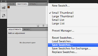
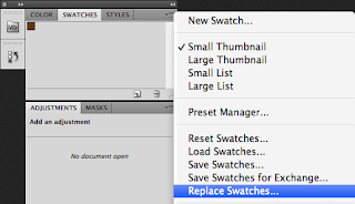
To open the blank swatch palette, from the same menu, select 'Replace Swatches...'
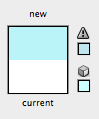
Any colours that can't be translated to print, show up in your palette
tool with a little exclamation, similar to the default one on
Illustrator.
The easiest way to apply a colour to a swatch is to have it set as a
foreground colour and then move your mouse over the swatch menu then add it.
No comments:
Post a Comment