Showing posts with label Workshop. Show all posts

Thursday, 18 October 2012

Design Production: Print Workshop 3

In todays session we will be looking at Process and Spot colours in regards to the processes we used last year on InDesign. Preparing our skillset and knowledge for commercial printing.


Always select new document, at least most of the time. Check the settings for your document and make sure everything is correct when setting up, saving time and hassle.


Page size in the document setting is never to be overlooked, you should always know what size your page will be finished and ready, which will help decide what size to make the document.

Columns can be used as guides whilst working and help for layout and placement of the context in your design. Similarly the margins will help to keep a uniform and consistent layout across your document/s.

When setting up the document, take into account whether bleed will be required within the document. Available in the 'More Options' menu, bleed is to be used when you'll be using colour up to the edge of the document, enabling you to be able to trim down the document removing unsightly white edges from your work.


Standard bleed is 3mm... talk to the printer to see how much bleed they require on the document.
Slug is the area around the document which can be used for crop marks and registration.


Facing pages can be useful to show double page spreads enabling easier alignment for cross page content.

This is a clip of the document showing the Margin, indicated by the far left violet line, black line is the edge of the document, red line is for the Bleed and the blue line is for the Slug.


To add colour to the document, you need to use a frame like above. Available from the tool bar to the left, similar to that of Illustrator.

To use your own colours from previous work, you can load a swatch library in the form of an ASE which works across Adobe software.


In regards to colour, colour can be applied in the frame either to the box as a whole or to the type using the box that's highlighted above or the 'T'.


Creating new swatches in InDesign is similar to that of Illustrator, InDesign even states the CMYK percentages as a standard.


To work with Spot Colours, change the Colour Mode and select the library you need. If you know the code for the colour you require then this can help source the colour faster.


Once applied, the Spot Colour will show itself in the Swatches menu, with a different icon to CMYK indicating that the swatch is Spot Colour.


The top icons being for CMYK and the bottom highlighted selection is to indicate a Spot Colour.

Using Spot Colours can help save you money, and to be clever with your inks you can set up 'Tint's of the colour to keep within your ink constraints but give you some flexibility.


Preparation of images into the document you're about to use is key, potentially the most important task. Incorrectly prepared images can cause enormous problems when going to print and maybe even ruining the whole run.

Preparation in Photoshop
Convert your image to CMYK or Greyscale if working within B&W.
Resolution of the image is important and should be set at 300 dpi in Ps, sizing should also be made to be the actual size in Ps so when imported, it will be right size for the document.
PSD or TIFF are the files used for images within documents, PSD enables use of transparency and can be edited still.

Preparation in Illustrator
Save the file as Ai.
Copy and paste is available from Ai to Indd.
Make sure you're working from CMYK mode.
Scaling in Indd from Ai files is enabled due to the files being vectors.

Wednesday, 17 October 2012

Design Production: Problem Solving

In todays session we were placed into groups and given the task to decipher the problems within a four page document. We screen captured key aspects to the task to illustrate how simple but costly some of the mistakes could be.


On the first page there was a couple of errors that became evident as soon as you exit the preview setting on InDesign. The image tree image placed in the document was missing it's link to the original file of the image which would cause the image to now print at 72 dpi as opposed to the original 300dpi image.
Secondly, there was a bleed set up on the document which wasn't being used, due to the background colour finishing where the document does, making the bleed ineffective and pointless.


This image illustrates that one of the images in the document had been set up at 72dpi, which again, could be a huge problem on a large print run. You could add pixels too the image but that will blur the image somewhat.


This image however was in 300dpi as required, but the size of the image was ridiculous. As we were supplied with the original image we could edit the image to the required size of roughly 463 x 312 pixels. Just saving the file over the one supplied and reconnecting the link solved the problem.


Another problem with the images was that one of them was left in RGB mode when placed and overlooked. Not a problem, we opened the original file in Photoshop, changed the colour mode to CMYK and saved over the original file. Reconnect the link, problem gone.


An abundance of unused Spot Colours still left in the Swatches, which could end up costing more money on a print job and confusion to yourself. Tidy up them swatches.


We checked that all the inks were fine to be printed via the Separations window which shows any colours that wouldn't be produced in the print. Weirdly the text on the back page showed up, it was set to be the registration. Change to straight black, everything is printable.


Another swatch problem was the fact that there was an RGB colour making an appearance somewhere in the document. Change the colour mode by opening up the swatch, luckily, this one transferred nicely from RGB to CMYK.


Use the Preflight menu at the bottom to see how many problems you have. This was indicating the missing link of the tree image, not available with the document and other images.


When dealing with a commercial printer, package your publication. This enables you to give the printer instructions that are embedded with the file as well as making sure you keep your fonts, images and a final update of the image links.

Friday, 12 October 2012

Design for Print

In todays session, we looked at how to work with colours in Adobe Photoshop.

Once Photoshop is open, first check the colour mode to see if the file is set up how you need, CMYK, RGB etc.

Photoshop files usually open in RGB, which is the standard file for web based design and the computer screen.
RGB colour is an additive process whereas CMYK is subtractive.

Design for print has to be set up to work with CMYK, which is a bit of a dip from the bright colours available with RGB and spot colours. CMYK mixes the ink on the page which can only create darker with more layers, whereas RGB being light based mixes into white, leaving some colours being unable to transfer to print via CMYK due to the gamut of the inks.

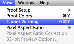
In Photoshop, we still work in RGB when designing for print, but can use a couple of tools in Photoshop to check whether the image will be printable by using either the 'Gamut Warning' or the 'Proof Colours' tool.


If prompted, the 'Gamut Warning' shows the areas of the image unable to translate to print as a grey mass, as pictured below.


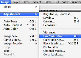
You can render this problem though by opening up 'Hue/Saturation' and lowering the saturation, in effect dulling the image and reducing how vibrant the original was.
 

 The other way to check if the colours in the image are all suitable for print is by the 'Proof Colours' tool, just above the 'Gamut Warning' option (which is probably a better tool).


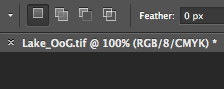
This indicates that the 'Proof Colours' tool is on, showing you're working in RGB colours but it's showing you the image you'd see, or a closer representation to the print, in CMYK.
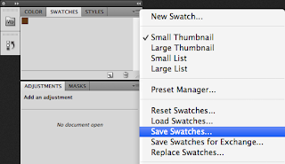
Adobe Illustrator swatches can be displayed in CMYK percentages if the user wants, however, this isn't available in Photoshop. Bit of a strange thing to leave out, but you can have a palette which can be opened across Ai, Ps and Id when the swatch library is saved as an ASE.

To clear your swatch palette in Photoshop, you can't just delete all the colours at once because there is not an option to do so, you have to delete them all individually. Once deleted, add one colour to swatch palette and save the swatch as a blank swatch and a good reference for a document that you'd need to remove the swatches from.


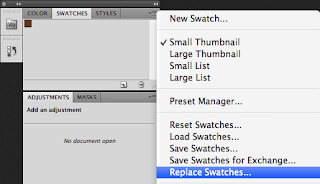
To open the blank swatch palette, from the same menu, select 'Replace Swatches...'


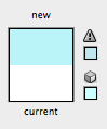
Any colours that can't be translated to print, show up in your palette tool with a little exclamation, similar to the default one on Illustrator.


The easiest way to apply a colour to a swatch is to have it set as a foreground colour and then move your mouse over the swatch menu then add it.

Print/Packaging Workshop

We were set the task to gather examples of print, which show branding and identity. I decided to go for products I found aesthetically pleasing and with a high quality of print or/and design.

Check out flick book for some of my products, put together with Issuu.


During the session, we had to arrange the products into 3 categories of bad, ok and good.

Our group decided the best way to do this would be to assess the quality of print, consider the design highly and the stock used.


We arranged the products using this general outline for what would fit into the categories available.

Good
High quality print.
Textures, both print and stock.
Innovative printing.
Personal taste.
Minimal, uncluttered design.
Good colour choice, foiling, embossing.
Bad
Cluttered design, badly considered.
Tacky.
Poor quality print.
Cheap stock, no textures.
Poor colour choice.
Badly considered design.
Bad colour choice.

Products that didn't quite make it into either, fell into the middle category of 'OK'.


I feel we got most of the placement of products in the right places, there was some food packaging which I thought belonged in the bad category. Following this, as a class we all decided what were the boundaries for each category.

Good
Nice feeling stock.
Sustainability.
Expensive appearance.
Durability.
Net complexity.
Ok
Disposability.
Good durability matched with bad design.
Average design.
Bad stock choice.
Mundane, familiar.
Bad
Overcrowded design.
Mass produced appearance and feel.
Poor quality imagery.
Mimicry.
Unneeded packaging.

Wednesday, 10 October 2012

Design Production: Print Workshop 2

In todays session, we looked at how to work with colours in Adobe Photoshop.

Once Photoshop is open, first check the colour mode to see if the file is set up how you need, CMYK, RGB etc.

Photoshop files usually open in RGB, which is the standard file for web based design and the computer screen.
RGB colour is an additive process whereas CMYK is subtractive.

Design for print has to be set up to work with CMYK, which is a bit of a dip from the bright colours available with RGB and spot colours. CMYK mixes the ink on the page which can only create darker with more layers, whereas RGB being light based mixes into white, leaving some colours being unable to transfer to print via CMYK due to the gamut of the inks.

In Photoshop, we still work in RGB when designing for print, but can use a couple of tools in Photoshop to check whether the image will be printable by using either the 'Gamut Warning' or the 'Proof Colours' tool.


If prompted, the 'Gamut Warning' shows the areas of the image unable to translate to print as a grey mass, as pictured below.


You can render this problem though by opening up 'Hue/Saturation' and lowering the saturation, in effect dulling the image and reducing how vibrant the original was.
 

 The other way to check if the colours in the image are all suitable for print is by the 'Proof Colours' tool, just above the 'Gamut Warning' option (which is probably a better tool).


This indicates that the 'Proof Colours' tool is on, showing you're working in RGB colours but it's showing you the image you'd see, or a closer representation to the print, in CMYK.
Adobe Illustrator swatches can be displayed in CMYK percentages if the user wants, however, this isn't available in Photoshop. Bit of a strange thing to leave out, but you can have a palette which can be opened across Ai, Ps and Id when the swatch library is saved as an ASE.

To clear your swatch palette in Photoshop, you can't just delete all the colours at once because there is not an option to do so, you have to delete them all individually. Once deleted, add one colour to swatch palette and save the swatch as a blank swatch and a good reference for a document that you'd need to remove the swatches from.


To open the blank swatch palette, from the same menu, select 'Replace Swatches...'


Any colours that can't be translated to print, show up in your palette tool with a little exclamation, similar to the default one on Illustrator.


The easiest way to apply a colour to a swatch is to have it set as a foreground colour and then move your mouse over the swatch menu and click and then add it
Working with Spot Colour
Spot colours can be good to set out gloss and other processes along with being exact with your colour. Spot colours come in the form of coded 'Pantone' swatches.
Creating a duotone image can be a good way of utilising colour and limiting how many single colours to go into the piece, reducing cost from expensive and not so sharp CMYK printing, to spot on spot colours, with the exact colour matched before printing. Before you create a duotone you need to convert the image to grayscale and then correct your levels so you have a well contrasted and exposed image, once done you can convert to duotone.


From the Image menu in 'Adjustments' there is an option for 'Curves' which can be used to control how the colours are distributed.

From the duotone option in Photoshop, you can mix upto four colours creating a 'Quadtone' image, to some interesting effects.

Spot colours can provide monetary rewards because they're cheaper to print requiring less inks, when working with spot colours the image will only work in greyscale. 'Image > Mode > Grayscale'.

Using Spot Colours with Channels can be beneficial to setting up your artwork, making sure that the colours you want are where they are.


When using Channels, the Channel stores the information on the Spot Colour and how it will be applied to the image.

Once the Spot Channel is selected then you can use the brush tool to paint over parts of your image that you want to have the Spot Colour applied too, this can also be done with selection tools like the magic wand, lasso etc. Instead of a solid block colour fill that removes details, the channel option masks the image with opaque colouring.

 
Spot Colour can be used to notify the printer where you want a varnish or a glue, use a colour that doesn't already exist in the artwork and notify the printer of this addition.

If you open up the artwork that includes Spot Colours into InDesign or Illustrator then the colour reappears and the swatch is there, enabling a solid colour to run through all products.

Save any files with Spot Colours as a tiff file format, along with the Spot Colour box, ticked.