
Showing posts with label print and web. Show all posts
Showing posts with label print and web. Show all posts
Monday, 4 February 2013
Web Design: Final Boards
The final boards for my Space Exploration website which should have been printed off.

Web Design: Technical
I needed to rely on mathematics for the technical side of web development. In order to make the website run consistently, I decided to change the amount of pages to 4 altering the navigation.
But the plus side of this is once the link is clicked, that spaceship will then link back to the homepage.

I had stated I would be designing to 1024 x 768 even this feels quite minute compared to certain websites which clearly incorporate coding I'm currently not aware of.
The title box is to be 800 x 200px, each rocket to be 350 x 150px with 60px spacing between them. They are to sit 418px from the top of the page totalling 800px leaving 122px either side of the navigation.
The title is to sit 188px from the top of the page relate to the subject matter of space, considering space across the whole layout.
On pages where content is to be placed, the navigation will stay the same although the box used for the title (#title) will be used in another stylesheet to hold scrollable content, I will alter the size and make it another 50px bigger lengthways.
But the plus side of this is once the link is clicked, that spaceship will then link back to the homepage.

I had stated I would be designing to 1024 x 768 even this feels quite minute compared to certain websites which clearly incorporate coding I'm currently not aware of.
The title box is to be 800 x 200px, each rocket to be 350 x 150px with 60px spacing between them. They are to sit 418px from the top of the page totalling 800px leaving 122px either side of the navigation.
The title is to sit 188px from the top of the page relate to the subject matter of space, considering space across the whole layout.
On pages where content is to be placed, the navigation will stay the same although the box used for the title (#title) will be used in another stylesheet to hold scrollable content, I will alter the size and make it another 50px bigger lengthways.
Web Design: Scamps
Following on from sessions which looked into developing scamps for our websites in relation to our summer brief, I mocked up 3 scamps which could be used for the coming crit session.


The scamps detailed the specific elements of each design, although they are all similar to some extent.
The target audience is aged 6-15, which needs to be reflected and deeply considered within the design and over all aesthetics of the site.
I decided to produce some coloured variations of the scamps I had so far to get a feel for colours and experiment a little.


Web Design: Final Scamp
From the crit I came away with a clear and concise direction for my website. I picked the scamp which had rockets as a navigation and decided to alter the target audience to younger audience.
The new target audience is to be 6-14 which is reflected in the chosen design and colourway.

I need to work out a site map and dimensions for the website as a whole, creating a css stylesheet for the whole website, courtesy of Simon's sessions.
The new target audience is to be 6-14 which is reflected in the chosen design and colourway.

I need to work out a site map and dimensions for the website as a whole, creating a css stylesheet for the whole website, courtesy of Simon's sessions.
Print Publication
ISTD: Final Presentation Boards
I've uploaded my final boards onto Issuu, although, had I had more time and money I would/should have put them onto disk if not printed them.
Tuesday, 29 January 2013
Print Publication
This was my final design after I had changed a few aspects of my design. I received a lot of feedback from the year group and the third years which lead to some final design decisions which can be found in the revised version of this Issuu in the newer post.
Thursday, 27 December 2012
ISTD Dixon Baxi 'Channel X' brief
I settled on a name for the channel which is to be BOLD television. I worked on ideas I had from selecting the name and the targets I had to meet for the channels ideal communication.
I considered the fact it was multicultural and decided to use capitals and bold letterforms to communicate the channel, boasting drama, reality tv, films, soaps and niche programs. The channel makes a statement and the name and initial logo ideas reflect this well.
 These were my initial ideas but refined slightly to show the general theme of what I wanted.
 I refined the logos further and added a rectangle at the end to represent the 'TV' although I'm unsure on whether to keep this or not.

I considered the fact it was multicultural and decided to use capitals and bold letterforms to communicate the channel, boasting drama, reality tv, films, soaps and niche programs. The channel makes a statement and the name and initial logo ideas reflect this well.


Friday, 12 October 2012
Design for Print
In todays session, we looked at how to work with colours in Adobe Photoshop.
Once Photoshop is open, first check the colour mode to see if the file is set up how you need, CMYK, RGB etc.
Photoshop files usually open in RGB, which is the standard file for web based design and the computer screen.
RGB colour is an additive process
whereas CMYK is subtractive.
In
Photoshop, we still work in RGB when designing for print, but can use a
couple of tools in Photoshop to check whether the image will be
printable by using either the 'Gamut Warning' or the 'Proof Colours'
tool.
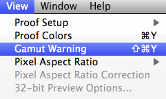
If prompted, the 'Gamut Warning' shows the areas of the image unable to translate to print as a grey mass, as pictured below.
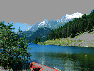
You
can render this problem though by opening up 'Hue/Saturation' and
lowering the saturation, in effect dulling the image and reducing how
vibrant the original was.
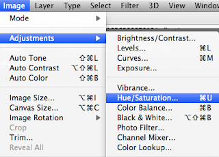
The
other way to check if the colours in the image are all suitable for
print is by the 'Proof Colours' tool, just above the 'Gamut Warning'
option (which is probably a better tool).
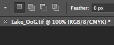
This
indicates that the 'Proof Colours' tool is on, showing you're working
in RGB colours but it's showing you the image you'd see, or a closer
representation to the print, in CMYK.
Adobe
Illustrator swatches can be displayed in CMYK percentages if the user
wants, however, this isn't available in Photoshop. Bit of a strange
thing to leave out, but you can have a palette which can be opened
across Ai, Ps and Id when the swatch library is saved as an ASE.
To
clear your swatch palette in Photoshop, you can't just delete all the
colours at once because there is not an option to do so, you have to
delete them all individually. Once deleted, add one colour to swatch
palette and save the swatch as a blank swatch and a good reference for a
document that you'd need to remove the swatches from.
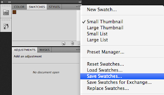
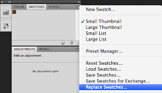
To open the blank swatch palette, from the same menu, select 'Replace Swatches...'
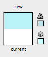
Any colours that can't be translated to print, show up in your palette
tool with a little exclamation, similar to the default one on
Illustrator.
The easiest way to apply a colour to a swatch is to have it set as a
foreground colour and then move your mouse over the swatch menu then add it.
Print/Packaging Workshop
We were set the task to gather examples of print, which show branding and identity. I decided to go for products I found aesthetically pleasing and with a high quality of print or/and design.
Check out flick book for some of my products, put together with Issuu.
During the session, we had to arrange the products into 3 categories of bad, ok and good.
Our group decided the best way to do this would be to assess the quality of print, consider the design highly and the stock used.

We arranged the products using this general outline for what would fit into the categories available.
Products that didn't quite make it into either, fell into the middle category of 'OK'.


I feel we got most of the placement of products in the right places, there was some food packaging which I thought belonged in the bad category. Following this, as a class we all decided what were the boundaries for each category.
Bad
Overcrowded design.
Mass produced appearance and feel.
Poor quality imagery.
Mimicry.
Unneeded packaging.
Check out flick book for some of my products, put together with Issuu.
During the session, we had to arrange the products into 3 categories of bad, ok and good.
Our group decided the best way to do this would be to assess the quality of print, consider the design highly and the stock used.

We arranged the products using this general outline for what would fit into the categories available.
Good
High quality print.
High quality print.
Textures, both print and stock.
Innovative printing.
Personal taste.
Minimal, uncluttered design.
Good colour choice, foiling, embossing.
Bad
Cluttered design, badly considered.
Tacky.
Poor quality print.
Cheap stock, no textures.
Poor colour choice.
Badly considered design.
Bad colour choice.
Products that didn't quite make it into either, fell into the middle category of 'OK'.


I feel we got most of the placement of products in the right places, there was some food packaging which I thought belonged in the bad category. Following this, as a class we all decided what were the boundaries for each category.
Good
Nice feeling stock.
Sustainability.
Expensive appearance.
Durability.
Net complexity.
Ok
Disposability.
Good durability matched with bad design.
Average design.
Bad stock choice.
Mundane, familiar.
Overcrowded design.
Mass produced appearance and feel.
Poor quality imagery.
Mimicry.
Unneeded packaging.
Subscribe to:
Posts (Atom)