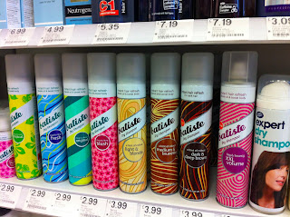
The Daily Mail covered dry shampoos in an article in 2011 which shows Batiste as the cheapest, most reliable dry shampoo. It also goes on to say that dry shampoo isn't necessarily used primarily for being lazy and not washing your hair, although this is one of the functions, but it's used for 'volumizing' hair, something I had not previously thought of.
Due to this, I decided to direct my design approach to mimic high end, expensive products.
I love how the angles of the glass reflect light in different directions and from inside to produce what appear to be different colours. I think mimicing this could have some good outcomes for a more 'glamorous' approach to the design of the product.
I stumbled upon an image of the dry shampoos available on the market to see what else was for offer, yet these are just the standard designs. I was thinking of using a full black silhouette similar to the latter two in the image above. Seeing it in context has slightly worried me, I think the solid black comes across as too bold and invading to some extent. In my opinion, not attracting the target audience at all. I think the black could be broken up with opaque colouring, taken from the original colours for Batiste, or maybe some kind of glitter overlay.
Tresemme use a similar approach with their other products as to what I was thinking, yet I think the branding for Batiste is stronger as a hair brand and also boasts a better visual identity. Whereas I find the Tresemme logo unappealing due to it's mix of letters and how it looks as though it's a sticker, in a bad way, the use of colouring and the way it plays with the light is something I'd like to achieve.
The
gold version that they released as a limited edition features an effect
that could be incorporated within my design but not with the underlay
of patterns and used as an overlay over a matt black to induce the
'glamorous' aesthetic.
The design behind this edition boasts a glitter, or shimmer, effect with the dots in the design. I feel these could be beneficial to my design process. Enabling me to judge what is possible within the print process of the products.
Batiste made special packs titled 'Cool Britannia' which shows an artistic representation of the Union Jack and were presented in a red netting and extras like this mini brush.
I love the fact they add extras in, although I'm not too certain on the regularity of the extras, and would like to design some for proposal.
The only other packaging that I could find for Batitse products was this little zipped bag, which shows the contents as 3 mini cans of Batiste in their limited colourways 'Wild' but the bag is impractical as the clientele is different to what they think, in my opinion. The bag was intended to be reused by whoever bought them, but I think it wouldn't be used and the product added to a handbag of choice or other luggage item. I'd like to experiment with boxes for packaging which reach out to the 'glamorous' clientele, who don't need a new bag that has been cheaply made, but a box that compliments the product and talks to the target audience in a similar way to perfume brands.
Batiste
point of sale, shelf style, looks pretty good due to the variety of
designs on the shelf, I feel they compliment one another due to the
consistency of the rest of the product, i.e branding & relevant
information. This needs to be highly considered when I design for the
brand.


No comments:
Post a Comment